Designing a Mindful Habit Tracker for Everyday Balance
A productivity and wellness app that helps users stay consistent with small daily actions—through calm visuals, personalized progress, and positive reinforcement.
The Habit Loop
Project Overview
Habit Loop is a wellness-focused mobile app designed to help users build and sustain healthy routines through intuitive design, micro-interactions, and gamified progress tracking. The goal of this project was to create a clean, engaging, and human-centered interface that makes habit formation feel natural, rewarding, and visually motivating.
The app empowers users to track everyday habits such as water intake, sleep, meditation, reading, and walking, while receiving smart reminders, progress feedback, and motivational milestones. Each feature was thoughtfully crafted to support the psychology of habit-building—encouraging consistency through small wins and positive reinforcement.
This case study explores the end-to-end design process — from understanding user behavior and defining goals to creating interactive prototypes, visual systems, and a cohesive UI that blends productivity with wellness.
Research & Insights
To understand what motivates (or hinders) people from maintaining healthy habits, I conducted a user survey and 3 in-depth interviews with individuals aged 20–35, primarily students and young professionals who use at least one productivity or fitness app.
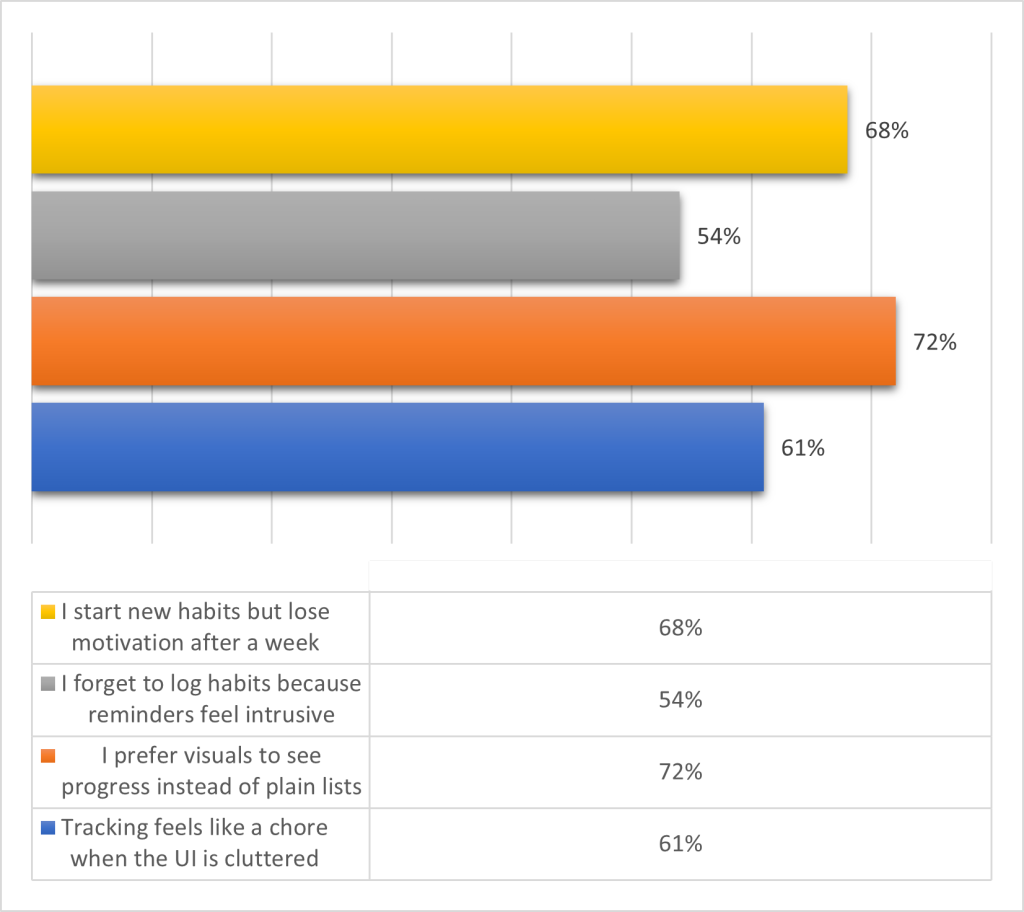
Key Survey Data (n = 35 respondents)
| Insight | Number of Responses | Implication |
|---|---|---|
| “I start new habits but lose motivation after a week.” | 24 respondents | Gamification and progress feedback are essential. |
| “I forget to log habits because reminders feel intrusive or inconsistent.” | 19 respondents | Introduce smart, context-aware reminders. |
| “I prefer visuals to see progress instead of plain lists.” | 25 respondents | Integrate visual progress loops and badges. |
| “Tracking feels like a chore when the UI is cluttered.” | 21 respondents | Prioritize minimalism and intuitive navigation. |
Interview Highlights
Three recurring themes emerged:
- Motivation fades when users can’t see small wins.
- Reminder fatigue occurs when notifications lack personalization.
- Visual feedback (like progress bars and streaks) boosts emotional connection.
Persona Snapshot
User Persona: The Consistency Seeker
- Name: Ada
- Age: 27
- Occupation: Marketing Associate
- Goal: Build daily discipline with small, achievable habits.
- Frustration: Feels discouraged when apps are too data-heavy or rigid.
- Needs: A flexible, visually motivating app that celebrates progress.
Design Process & Wireframes
The design of Habit Loop was guided by a balance of psychology and usability — turning healthy intentions into repeatable, rewarding actions. I approached the design in iterative layers, beginning with a clear structure before introducing visual emotion and micro-interactions.
1. Ideation & Defining the Experience
After reviewing user pain points, I began by identifying what a “good day” looks like for someone trying to build consistency. The question was:
“How might we make habit tracking feel light, motivating, and emotionally satisfying — not like another task?”
I focused on creating a design that feels supportive, intuitive, and reward-driven, inspired by the idea of looping progress. Each touchpoint in the app — from reminders to streak messages — reinforces a cycle of cue → action → reward.
The primary goal was to design an app that helps users:
- Start small, stay consistent, and feel rewarded.
- Visualize progress through a clean, intuitive interface.
- Receive smart reminders without notification fatigue.
To achieve this, the design process followed a loop of empathy → ideation → prototyping → testing — mirroring the habit loop concept itself.
2. Information Architecture
I mapped out user flows to ensure minimal friction between onboarding, tracking, and progress visualization.
Core Flows Included:
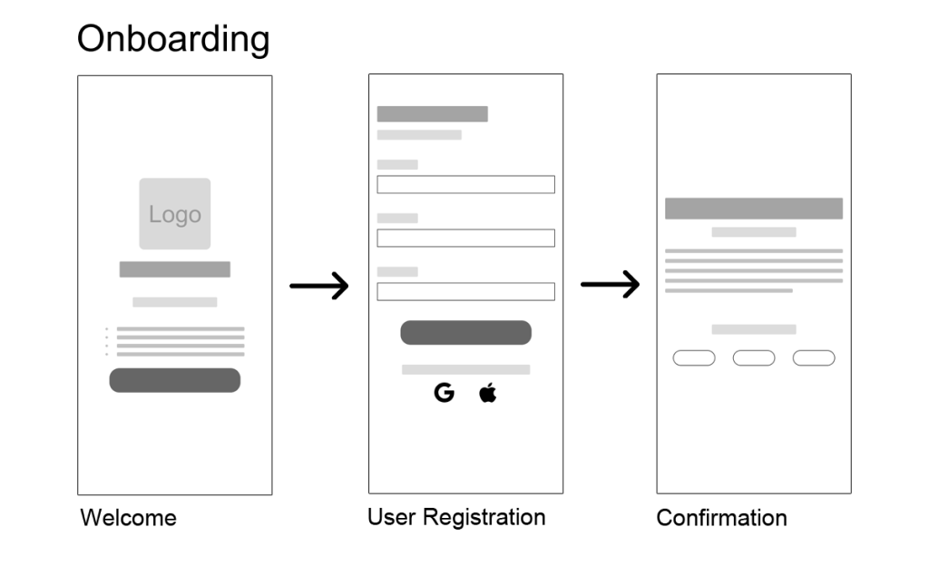
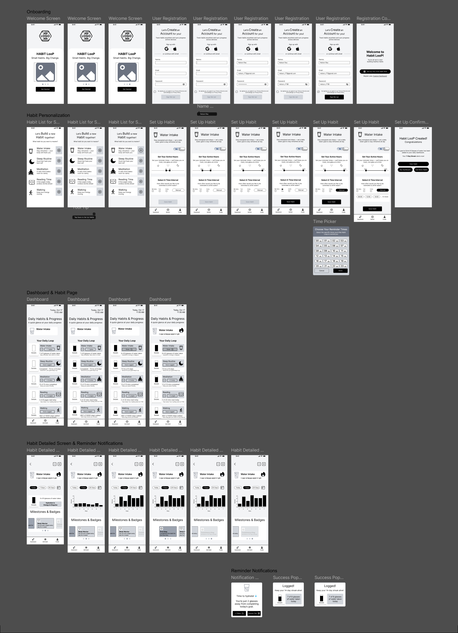
- Onboarding & Add Habit Flow: Guided setup with goal selection and reminder settings.
- Dashboard View: All habits at a glance with progress indicators.
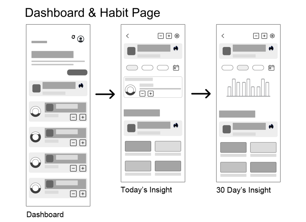
- Habit Detail Page: Insights, streaks, and motivational messages.
3. Wireframing (Low-Fidelity Exploration)
Using grayscale wireframes, I explored various layouts to find the most intuitive structure. The focus at this stage was on hierarchy, spacing, and user flow clarity rather than color or aesthetics.
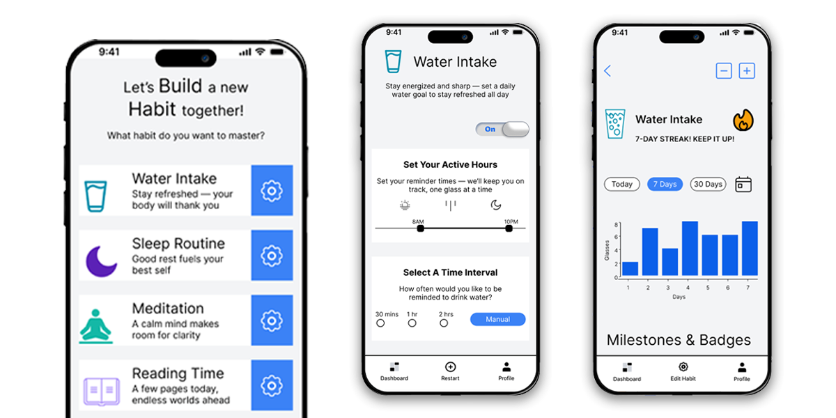
Wireframed Screens Included:
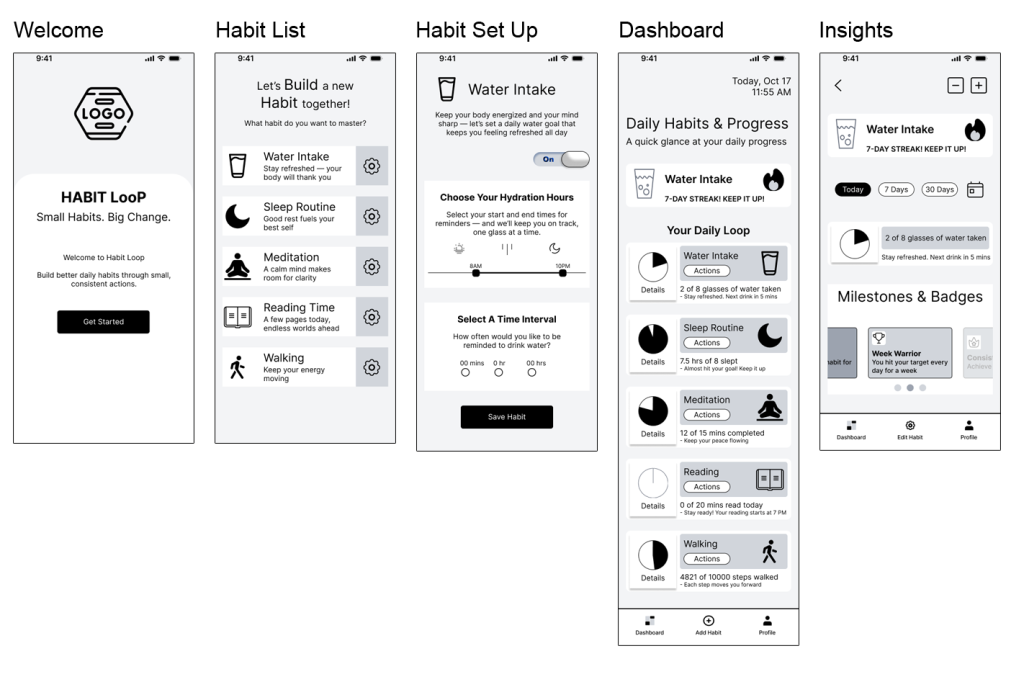
- Onboarding Screen — Welcoming message, simple CTA (“Get Started”)
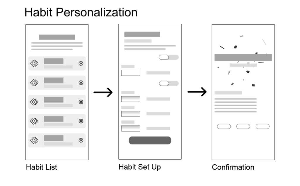
- Add Habit Flow — Habit type selector, reminder options, goal input field
- Dashboard — Layout with progress circles and habit summaries
- Habit Detail View — Graph for weekly and monthly progress, streak count, and motivational quote
- Achievements Section — Carousel of badges and milestones
4. Feedback & Iteration
During early testing with 5 participants:
- 4 users preferred progress horizontal bars over circles for motivation.
- 3 users felt the onboarding needed more visual storytelling (hence the later addition of the intro carousel).
These insights directly informed the mid-fidelity prototypes.
5. Mid-Fidelity & Usability Testing
After low-fidelity validation, I developed a mid-fidelity clickable prototype for early testing.
- Participants: 5 users (aged 22–35, balanced gender, daily phone users)
- Duration: 15-minute guided tasks (e.g., “Set up a new habit,” “Adjust a reminder”)
Key Insights:
- 4/5 users loved the “Add Habit” flow clarity but wanted more positive reinforcement on the dashboard.
- 3/5 found the “Set Reminder” screen more intuitive after adding a “Custom Interval,” button that lets them select preferred specific times, using a multi-select time picker.
- 2/5 felt more connected after seeing “friendly feedback messages” like “You’re doing great — stay hydrated!”
These results informed the next stage — adding color psychology, motion, and emotional cues in the high-fidelity prototype.
High-Fidelity Design & Visual System
Once the structure and usability were validated, I moved into the high-fidelity phase — transforming functionality into a visually uplifting, emotionally engaging experience. The goal was to make users feel good about every small win, reinforcing the idea that progress, no matter how tiny, matters.
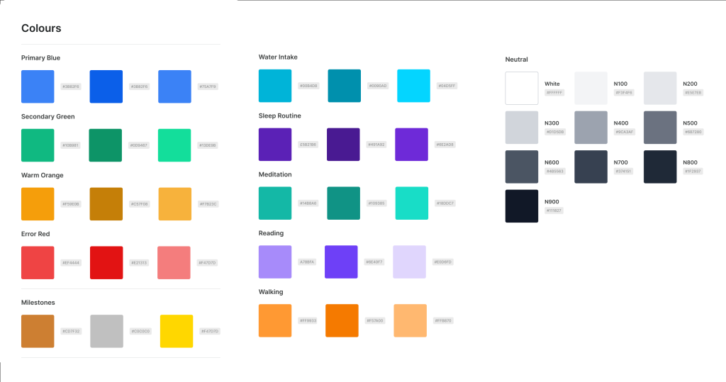
The final design translates the app’s purpose — balance, clarity, and motivation — into a clean visual system built entirely with solid colors and thoughtful contrast. The interface maintains a light, approachable feel with neutral grays and whites, while vibrant accent colors distinguish each habit for instant recognition.
View Prototype Video
Results & Takeaways
Results
Habit Loop successfully delivers a clear, intuitive way to build healthy routines through thoughtful design and meaningful interaction.
- The simplified onboarding improved setup speed and engagement.
- Micro-interactions and habit-specific visuals made progress feel rewarding.
- Smart reminders and streak tracking boosted motivation and consistency.
Takeaways
This project reinforced the power of simplicity, consistency, and emotion in wellness design.
I learned how much small details — like tone, timing, and visual feedback — can shape user behavior.
More than just a habit tracker, Habit Loop became a study in how design can make wellness feel personal, joyful, and achievable.