Product Personalization Flow Redesign
Enhancing Usability & Conversion on SpaceStylist Custom Gift Product Pages
Project Overview
This project focused on a critical redesign of the SpaceStylist product page for personalized gift items. The initiative was driven by direct customer feedback indicating significant frustration with the existing product customization platform, specifically citing its complexity, excessive steps, and lack of creative guidance.
Scope and Goal
The scope of this redesign centered on transforming the user experience directly on the product page, making the transition from product selection to customization effortless and enjoyable.
The primary goal was to elevate customer satisfaction and drive higher conversion rates for customizable products by:
- Reducing Cognitive Load: Simplifying the information architecture and presenting customization choices in a logical, step-by-step manner.
- Boosting Completion Rates: Eliminating unnecessary friction points that caused users to abandon the design process (the “Customization Funnel”).
- Integrating Smart Tools: Introducing innovative features, like AI writing assistance, to turn a common point of struggle (writing a perfect message) into an easy, value-added experience.
This report details the methodology used, the specific UX/UI changes implemented, and the expected impact of creating a more intuitive and AI-enhanced personalization flow.
Problem Statement
SpaceStylist offers a wide range of personalized gift items, allowing customers to transform photos and messages into beautiful, custom-made products. However, the existing WooCommerce product page for customization was not meeting customer expectations. Users frequently struggled to complete the personalization process due to its complexity, lack of clarity, and the number of steps required.
Feedback revealed that customers found the design platform overwhelming, especially when asked to manually write messages, choose design styles, and understand how their final product would look. These challenges created friction in what should be an enjoyable, creative experience.
This resulted in several recurring issues:
- High Abandonment Rates: Many users left the page before completing their order because the process felt too complicated.
- Poorly Structured Workflow: The customization flow lacked a clear step-by-step structure, causing uncertainty and confusion.
- Difficulty Writing Messages: Customers often struggled to craft personalized messages that felt meaningful.
- Limited Visual Feedback: Users couldn’t visualize their final design early enough, reducing confidence in making selections.
- Cognitive Overload: Too many decisions upfront made the process feel mentally tasking rather than exciting.
These pain points negatively affected customer satisfaction and reduced the overall conversion rate for SpaceStylist’s personalized gift products.
The challenge became clear:
How might SpaceStylist redesign its product customization experience to be simpler, more intuitive, and more enjoyable—while integrating intelligent AI assistance that empowers users rather than overwhelms them?
Research Insights
To understand why customers were struggling with the customization process on SpaceStylist’s product page, I conducted a combination of user feedback analysis, usability observations, and heuristic evaluation of the existing interface. The research revealed consistent friction points that directly impacted customer satisfaction and conversion.
1. Users Struggled With an Overwhelming Number of Steps
Many customers expressed that the process felt too long, with multiple decisions required before they could visualize any progress. This created a sense of friction early in the journey, leading to hesitation and drop-offs.
2. Customers Found it Difficult to Craft Personalized Messages
A significant number of users paused at the message-writing stage. They struggled to find the right words for special occasions, leading to message fatigue and, in some cases, abandonment. Customers expressed a desire for suggestions or help with writing.
3. Limited Visual Previews Reduced Confidence
Users could not see how their uploaded photo, selected style, and message would come together until very late in the process. This lack of visual feedback contributed to uncertainty and discouraged experimentation with different styles or templates.
4. Competitor Benchmarking Highlighted UX Gaps
A comparison with leading personalization platforms revealed that many competitors already used guided flows, templates, and faster preview mechanisms. SpaceStylist’s existing interface lacked these modern UX patterns, placing it at a competitive disadvantage.
In Other Words…
Customers want a simple, enjoyable, and visually interactive customization experience. They prefer clear guidance, easy-to-use tools, and smart AI assistance that reduces decision fatigue and inspires creativity. The redesign needed to address these expectations to keep users engaged and confident while personalizing their gifts.
Solution Approach: Strategic UX/UI Improvements
The solution was a comprehensive redesign that shifted the customization process from a complex application to an integrated, contextualized design experience anchored directly on the SpaceStylist product page. Our strategy focused on three key pillars to ensure usability and creative enablement.
1. Simplify the Customization Workflow
Create a clear, step-by-step structure that reduces cognitive load and helps users understand exactly what to do at each stage. The process should feel linear, effortless, and manageable.
2. Integrate Smart AI Assistance
Introduce AI-powered features—such as message rewriting, automatic design variations, and art-style transformations—to help customers create beautiful personalized gifts without feeling overwhelmed or stuck.
3. Implement Visual Feedback Previews
A pop-up modal allow users to see their uploaded photo, selected art style, and chosen template applied in a high-resolution, real-life style view on the product.
User Personas
To better understand the needs of SpaceStylist’s customers and design a customization process that supports their goals, a representative user persona was developed. This persona reflect the dominant pattern observed during user feedback review and usability analysis.
The Thoughtful Gifter — “Ada”
Age: 25–35
Occupation: Working professional
Tech Skill: Moderate
Shopping Frequency: Occasional but purposeful
Goals
- Create a meaningful, personalized gift for a loved one
- Complete the order quickly without technical complexity
- Ensure the final design looks professional and beautiful
Pain Points
- Feels overwhelmed by too many customization steps
- Struggles with writing a heartfelt message
- Is unsure how the final design will look until a mock up is sent
- Prefers an experience that feels guided and stress-free
Needs
- Wide variety of templates and variations
- AI art-style transformations
- AI message assitance
- Quick previews that encourage experimentation
- A modern, visually appealing interface
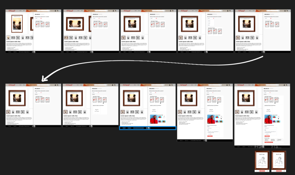
Wireframes
The wireframes focused on simplifying SpaceStylist’s product customization journey while ensuring clarity, flow, and ease of use. The goal was to remove unnecessary complexity, guide the user through a structured process, and introduce AI features without overwhelming the interface.
Below is a breakdown of the key wireframes created for the redesign.
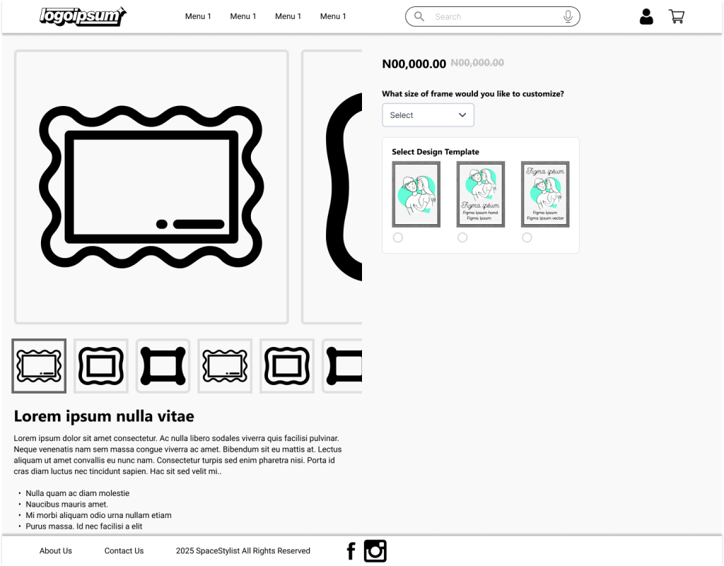
1. Product Page Hero Wireframe
Purpose: Provide users with a clean overview of the product and immediately draw attention to the customization process.
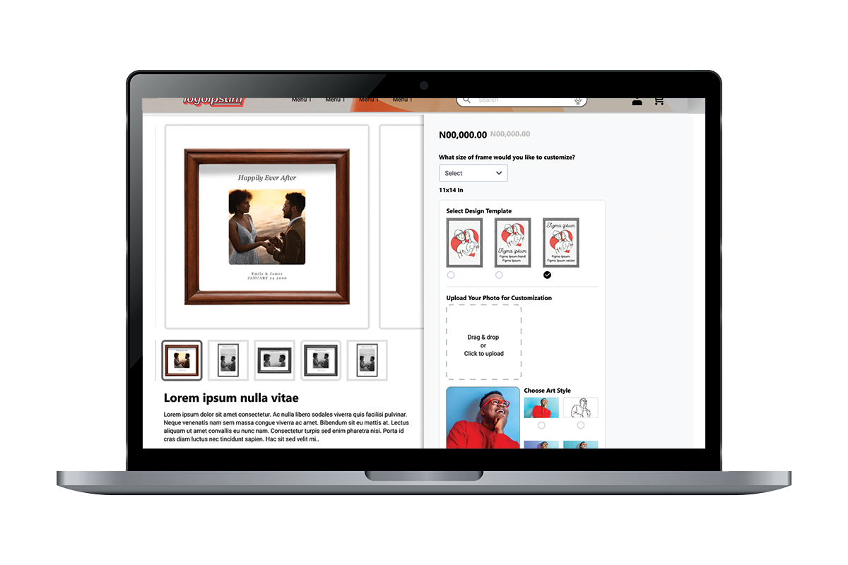
2. Step-by-Step Customization Wireframe
All customization steps are placed inside a clean card container with clear labels and progress indicators.
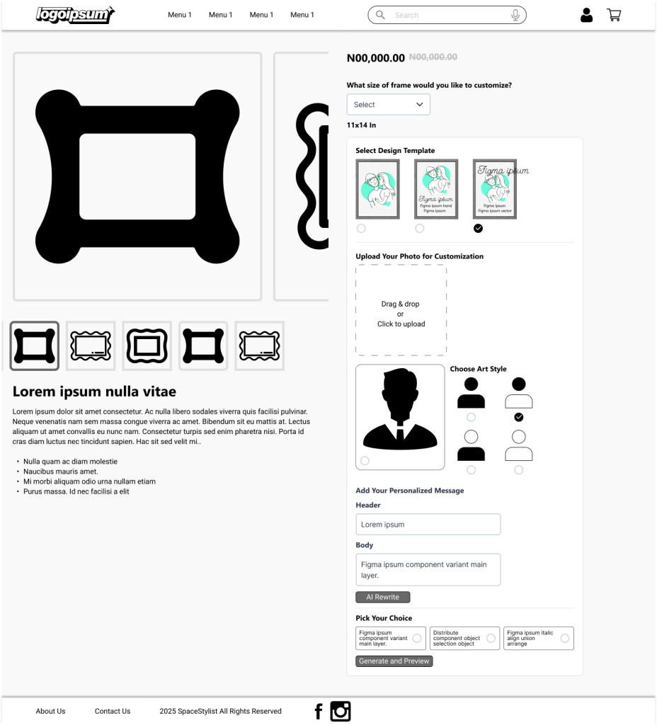
Step 1. Select Product Size
Users begin by choosing the exact size of the gift item they want to customize. Each size option is displayed as a dropdown list with dimensions, helping customers pick the right fit before moving forward.
Step 2. Select Design Template
Customers browse through pre-designed templates options. Each template features a unique layout and style.
Step 3. Upload Your Image
Users upload a photo they want to use for personalization. The platform supports high-quality images. Once uploaded, the photo becomes the central element that AI will transform into different art styles.
Step 4. Choose AI Art Style
The user selects how they want their uploaded image to be transformed. Options include Oil Painting, Sketch, Cartoon, and Watercolor, each represented with simple icons. After choosing a style, the system generates an AI-rendered variation.
Step 5. AI Message Rewrite
Customers can type in a personal message. With one click, the AI rewrites the message into clearer, more heartfelt, or more creative versions. Users can select their preferred rewritten option before moving on.
Step 6. Preview & Order
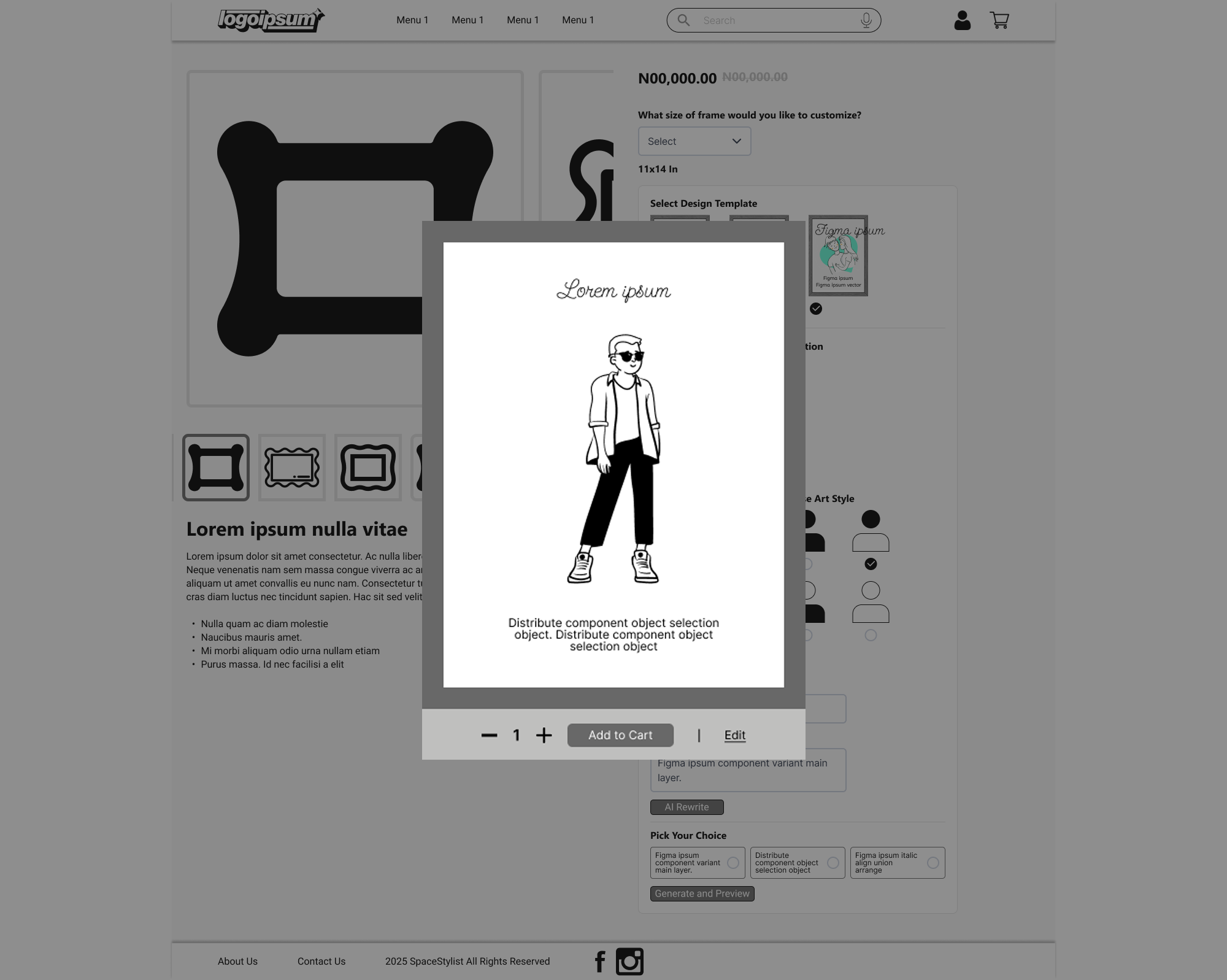
A photorealistic preview of the final customized product is shown in a clean pop-up. Once satisfied, the customer can proceed to add the item to their cart and complete their order.
These wireframes formed the foundational structure for the redesigned customization flow. The emphasis on clarity, controlled progression, and supportive AI interactions helped ensure that users would feel guided, confident, and excited throughout their customization experience on SpaceStylist.
Final UI Designs (High-Fidelity Mockups)
The high-fidelity designs bring the SpaceStylist customization experience to life with a clean, modern, and highly intuitive interface. Each screen is crafted to balance aesthetics with clarity, ensuring users enjoy a smooth, visually inspiring journey from product selection to final confirmation.
Visual Style & Branding
Color Palette
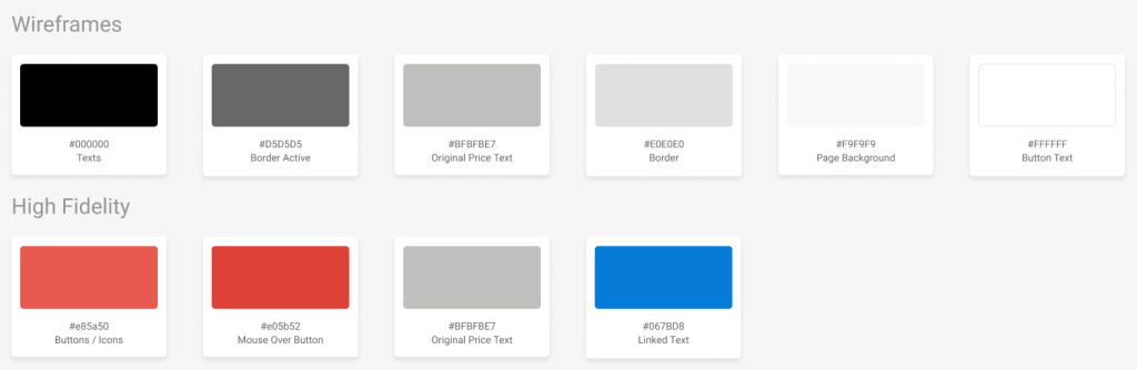
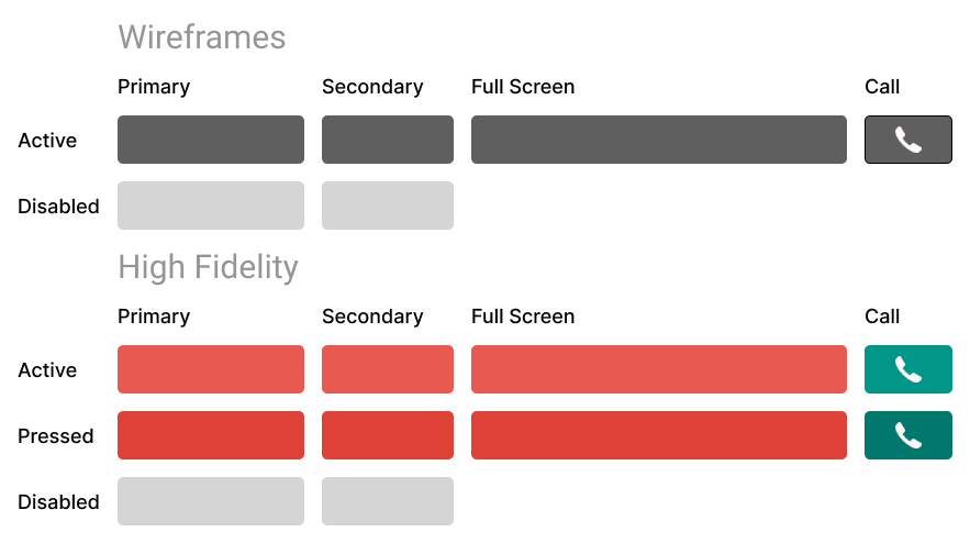
The SpaceStylist product customization interface uses a bold yet minimal color palette designed to enhance clarity, guide user attention, and support a clean visual hierarchy throughout the experience.
Primary Action Colors
- Coral Red – #E85A50
Used for primary buttons, key icons, and important interactive elements. This vibrant tone ensures high visibility and drives user engagement during critical steps.
- Soft Red Hover – #E05B52
Applied to hover states on buttons and interactive components, creating a smooth, responsive feel that improves usability and reinforces interaction feedback.
Neutral & Supporting Colors
- Black – #000000
Used for headings, strong text, and high-contrast UI elements to maintain readability and structure.
- Soft Gray – #D5D5D5
Used for borders, dividers, input fields, and secondary text. It helps separate sections subtly without overwhelming the design.
Typography: A strong, friendly sans-serif font, Segoe UI, for clarity and modern appeal.
Layout Language: Generous whitespace, rounded cards, smooth shadows, and subtle micro-interactions build a premium feel.
View Prototype Video
Results
The redesigned SpaceStylist WooCommerce product page delivered a streamlined and engaging user experience. The sequential steps approach of the customization guided customers smoothly through the process, revealing the next step only after the previous one was completed. This created a clean, uncluttered interface that kept users focused without feeling overwhelmed.
Despite the step-by-step flow, the customization process remained simple and intuitive, allowing users to easily select materials, sizes, and art styles for their products. The seamless progression of steps, combined with clear visuals and subtle interactive cues, enhanced engagement and encouraged exploration, ultimately supporting higher conversion potential.