WellPath — A Symptom Checker Redefined for Reassurance, Not Fear
A UX case study exploring how clarity, empathy, and design ethics meet technology to create a digital companion for early health guidance.
Introduction: The Beginning of WellPath
It all started with a simple observation:
People were turning to the internet for answers to their health concerns — and leaving more anxious than reassured.
As a designer, I asked myself:
Could a digital experience guide users through symptom checking with empathy, accuracy, and trustworthiness?
The Mission
To create a user-centered symptom checker app that offers gentle guidance, credible information, and cost transparency, while encouraging users to make informed healthcare decisions — not panic-driven ones.
The Design Journey
Understanding the Users
After initial user interviews and surveys, three main personas emerged.
Flip cards to learn more.
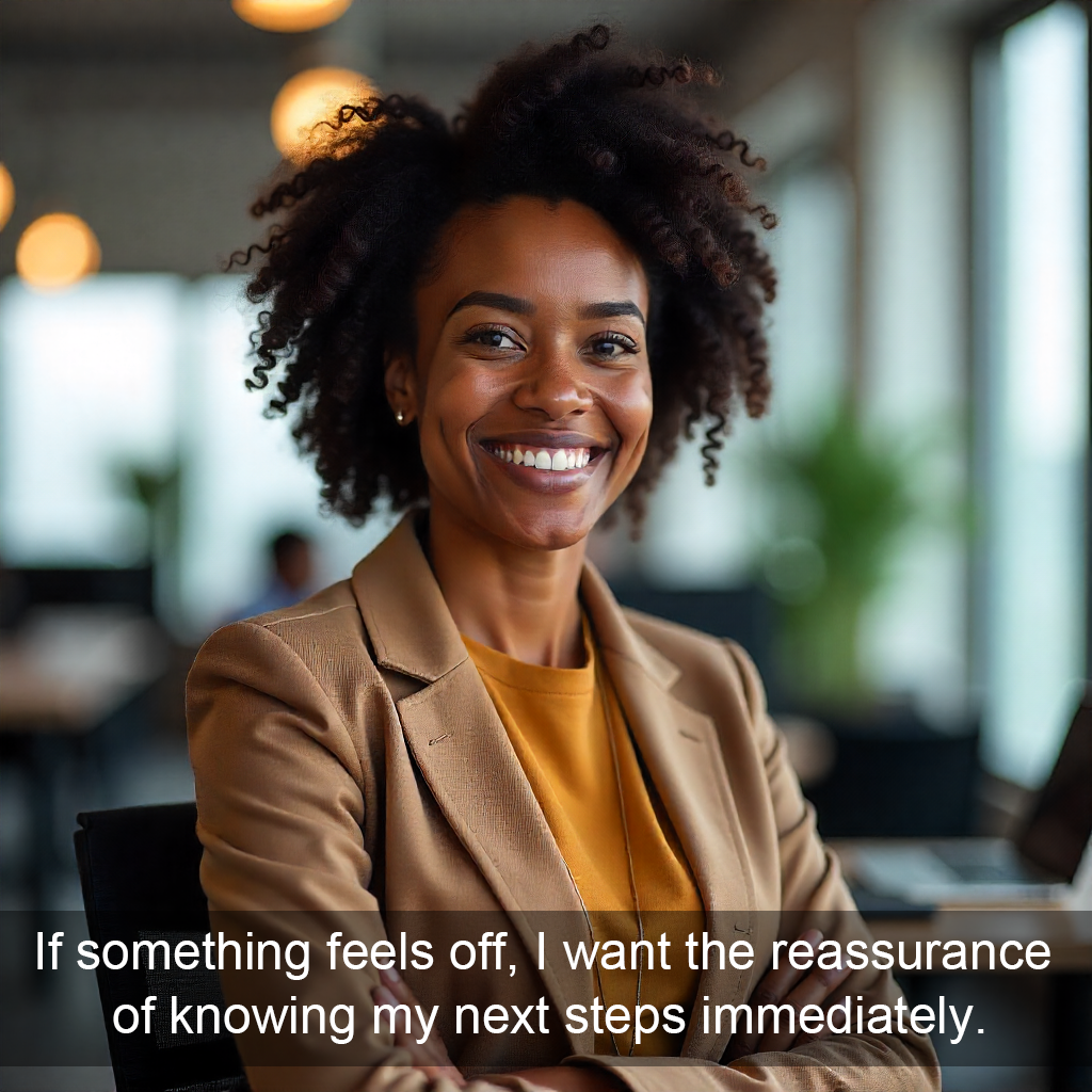
Busy Professional (Ada, 32)
- Struggles to find time to see a doctor.
- Wants a quick, credible health check before deciding if it’s serious.
- Prefers short, efficient user journeys.
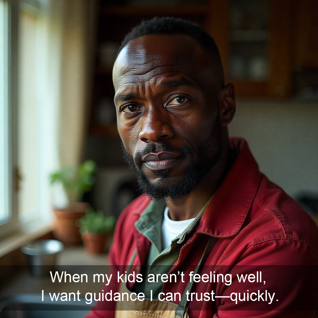
Health-Conscious Parent (David, 41)
- Worries about family health and often relies on digital health tools.
- Needs reassurance and trust from the app.
- Prefers a detailed, guided flow.
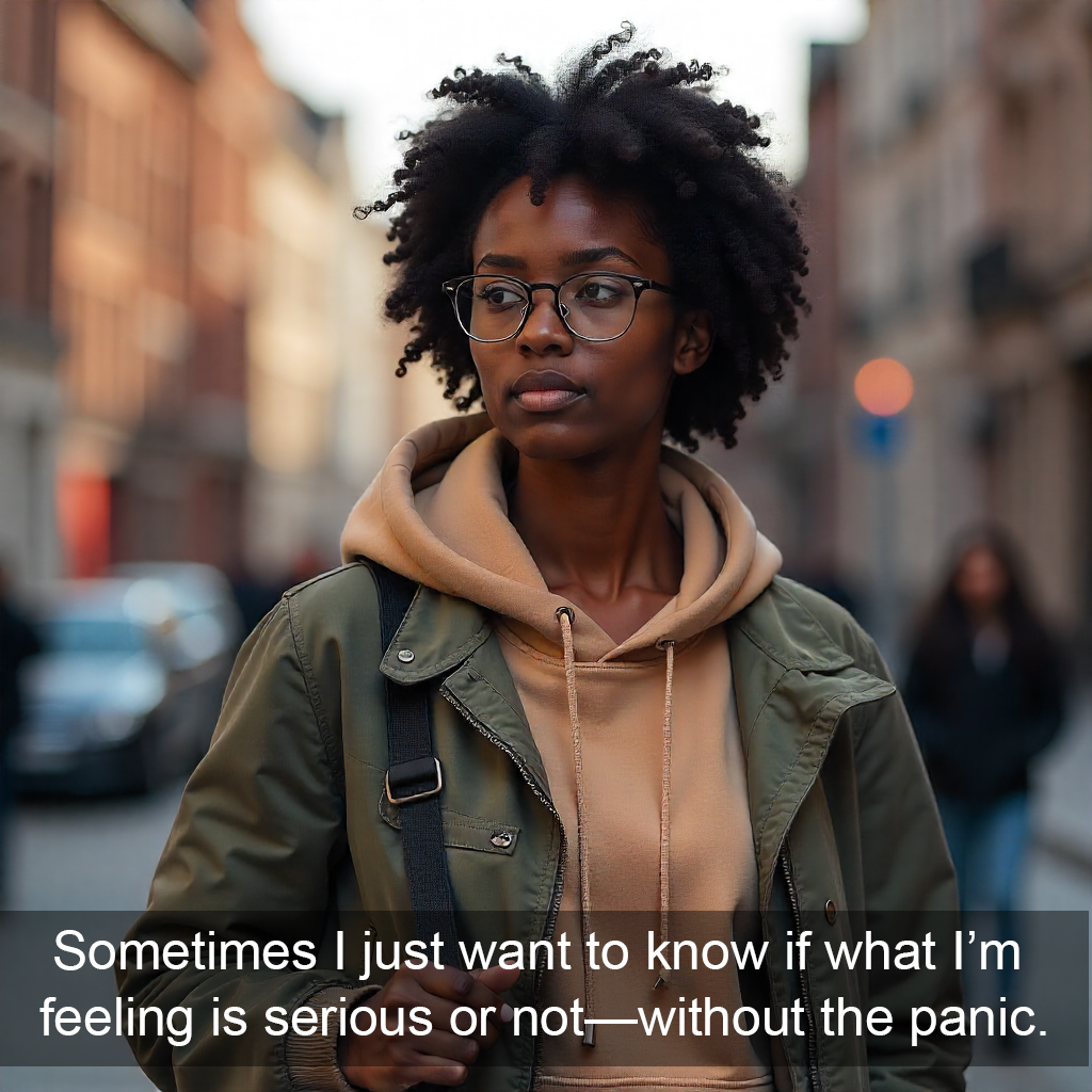
Student (Zainab, 21)
- Tech-savvy, open to digital tools.
- Needs an accessible, low-barrier experience.
Problem Statement
Users seeking digital symptom information often experience confusion, lack of clarity, and unnecessary anxiety.
How might we design a digital health tool that delivers clarity, empathy, and informed next steps — without overwhelming the user?
Objectives for the Solution
- Simplify symptom input and diagnosis flow.
- Build emotional trust through tone, visuals, and transparency.
- Offer cost visibility and encourage NHIA health cover enrollment.
Research & Insights
Methods Used
- Competitor analysis of top symptom checkers (WebMD, Ada Health).
- Surveys and preference tests on Lyssna with early prototypes.
- Heuristic evaluation for usability and ethical communication.
Key Insights
- 57% preferred a reassuring, guided flow (Flow A).
- 25% of those wanted it to be slightly shorter — leading to a hybrid flow.
- Transparency about treatment costs and health insurance increased user trust significantly.
Defining the Scope
Initially, the project included multiple features — symptom checking, doctor locator, NHIA programs, and monitoring.
Through prioritization workshops, I narrowed it down to core MVP features:
- Symptom Checker
- Cost Transparency
- NHIA Health Program Integration
- Doctors Near Me
User Flows
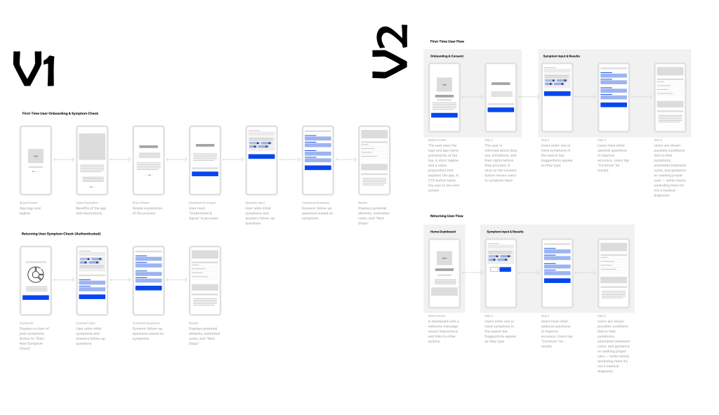
The first iteration tested clarity of steps and tone.
Two user journey prototypes were created — Flow A (Reassuring) and Flow B (Quick & Efficient).
Outcome:
The hybrid solution merged Flow A’s warmth with Flow B’s efficiency, creating a balance between emotional reassurance and functional simplicity.
Design Evolution
Mid-Fidelity to High-Fidelity:
As feedback came in, visual design elements emphasized trust, empathy, and ease:
- Rounded corners, soft color gradients, calm typography.
- Conversational tone (“Let’s figure this out together”).
- Smooth transitions between steps.
Validation & Testing
User Testing Highlights:
- Most users completed the symptom check in
 ≤2 minutes.
 - Positive emotional feedback: “It feels calming, not scary.”
- 80% said they’d recommend the app to a friend.
Iterations:
- Simplified symptom input language.
- Added estimated treatment cost range.
- Integrated doctors’ map with location-based results.
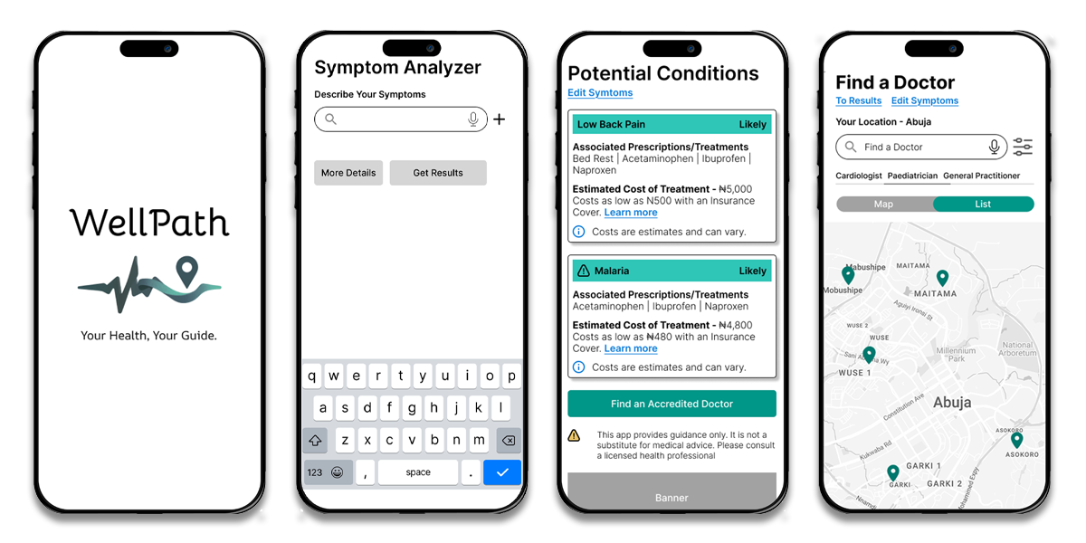
Final Hybrid Design
Flow Summary:
- Splash Screen →
- Disclaimer & Consent →
- Symptom Input →
- Possible Ailments + Drugs Costs →
- Doctor Finder →
- NHIA Program Options
View Prototype Video
Takeaways & Reflection
What I Learned:
- Empathy and ethics must lead every design choice in digital health.
- Balancing reassurance with efficiency creates meaningful engagement.
- Data-driven iteration transforms assumptions into user-centered reality.
Quote to end:
“Design isn’t just about making interfaces intuitive — it’s about making people feel seen, supported, and safe.